
ITS, a company you don’t know exists unless you are in the electricity business for connectivity. A non profit organization.
Take the next step in the market
Help us be more modern
ITS, a company you don’t know exists unless you are in the electricity business for connectivity. A non profit organization.
They were looking to have a new Brand Identity made from scratch. As a freelancer at the time, I started with a workshop with the board to find out more about what the company stands for and where they want to go.
I then went to the drawing board and there were a few words that stood oout, connectivity, inclusion, and non profit.
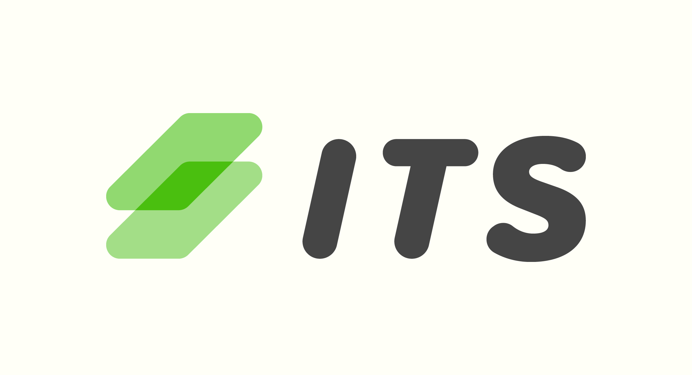
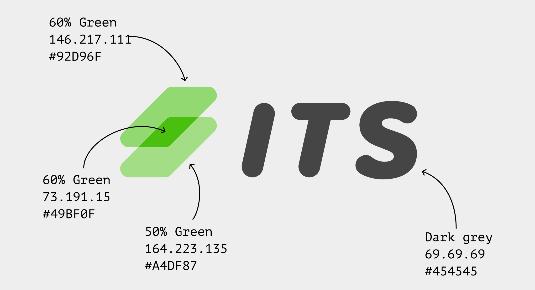
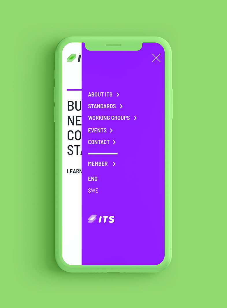
So the plates on the logo stand for the standards in the business and the overlapping and darker part in the symbol, is the connectivity.
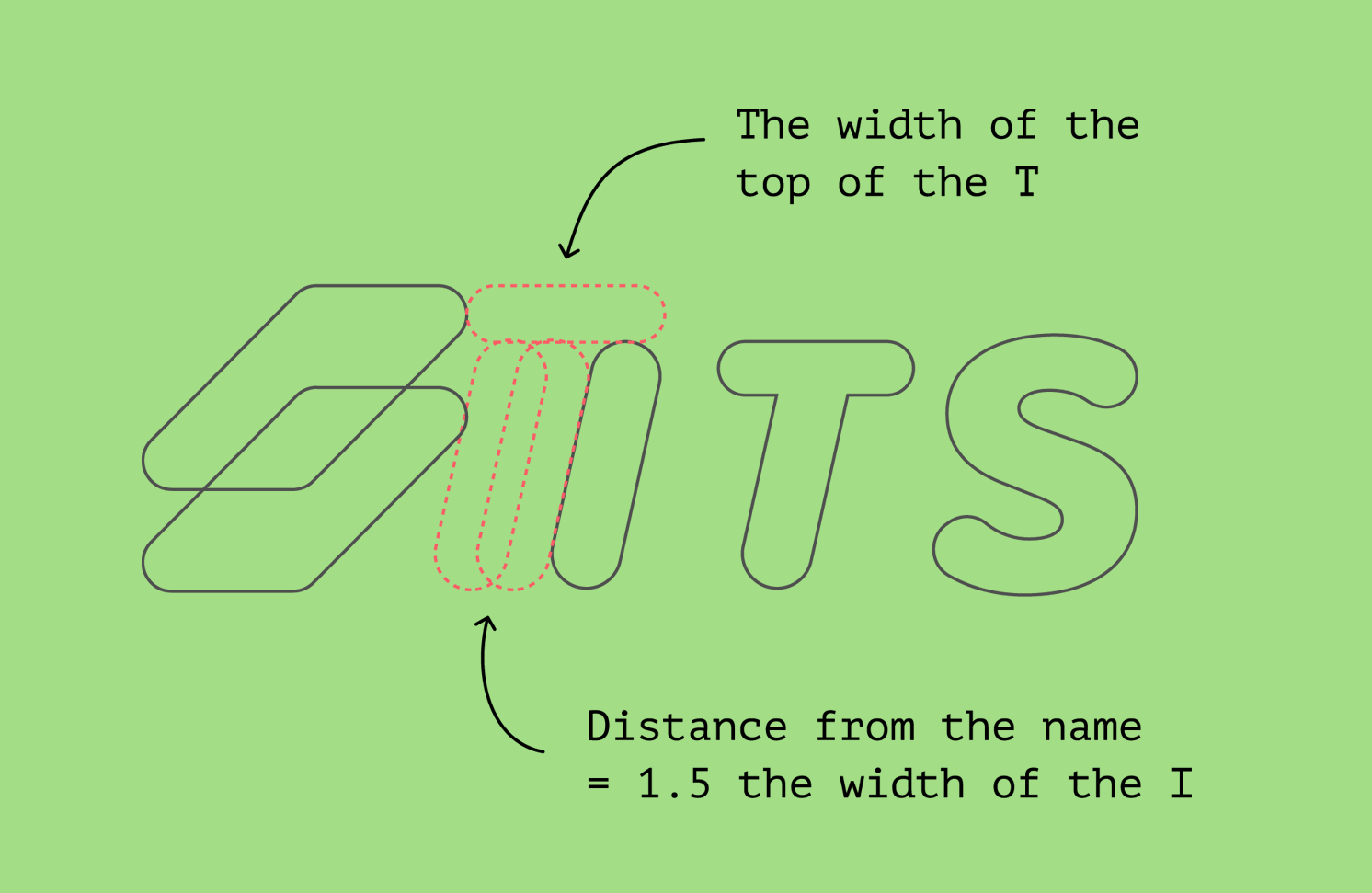
I also like to make it logical when it comes to the spacing in a logo so that is all connected, get it :)
The gap between the symbol and the name, is to be 1.5 of the width of the I.
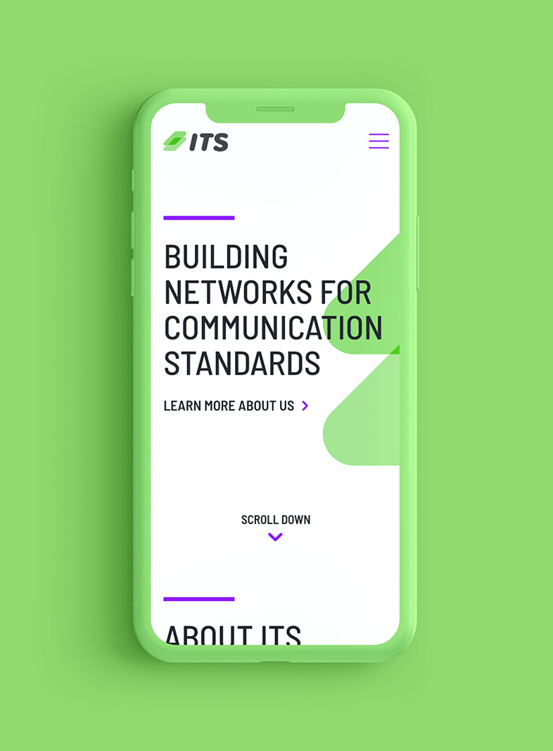
My main focus was on the brand itself and mockups of the site was made.