
At ted&gustaf, I worked as a full-time employee and was thrown right into something I love. Updating a brand Identity.
Update the identity in a new way, with
colors already decided
Hey, here’s your first
thing to work on :)
At ted&gustaf, I worked as a full-time employee and was thrown right into something I love. Updating a brand Identity.
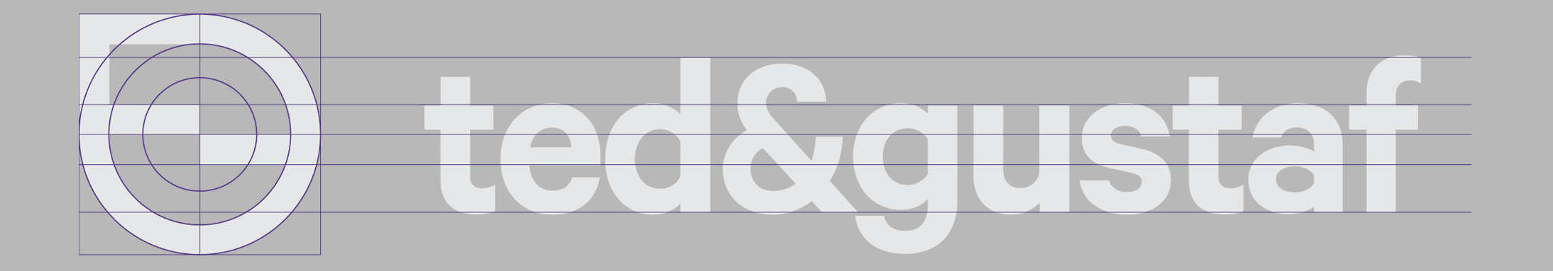
This project was a little unusual for me as so many things were already decided upon, all except a logo. Colors, fonts and most of the website was already designed and more or less ready to go. (I would prefer to start with the logo and work through color choices as the identity grows).
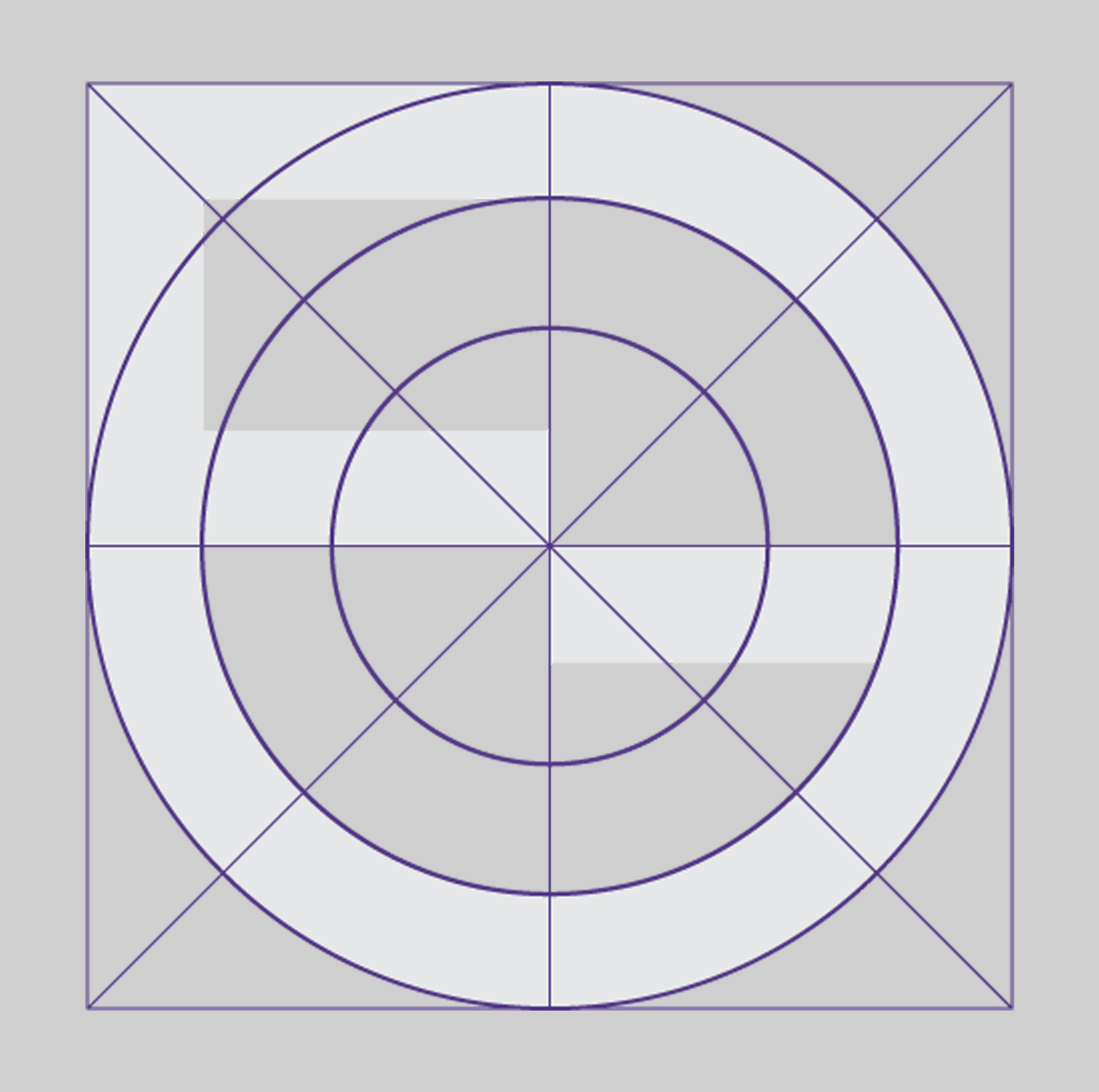
So the process was a little upside down, but a great challenge. I did research, listened to the UX-designer that had started the project, and started sketching and turning the paper upside down, yes I do like to sketch IRL, playing with the letters and shapes.
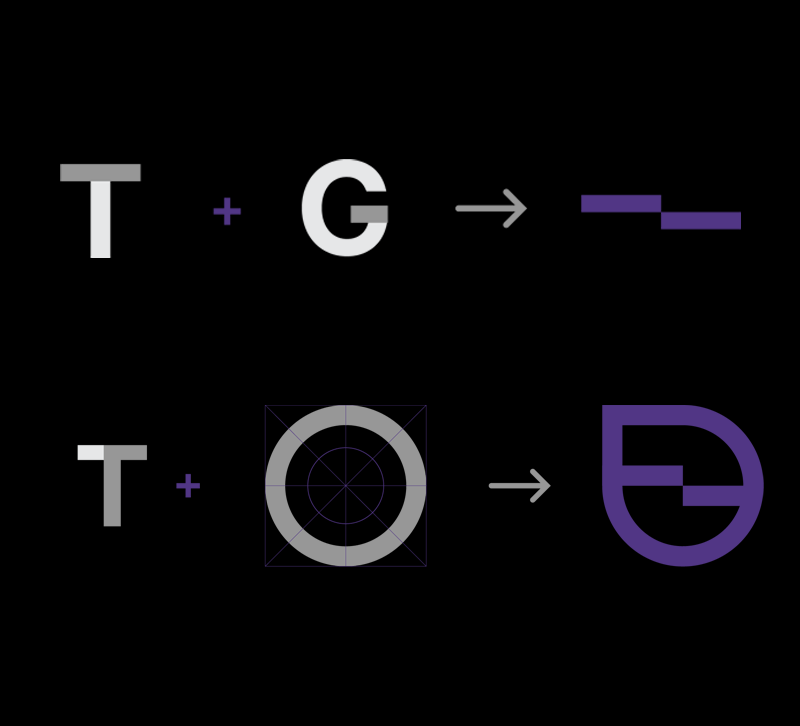
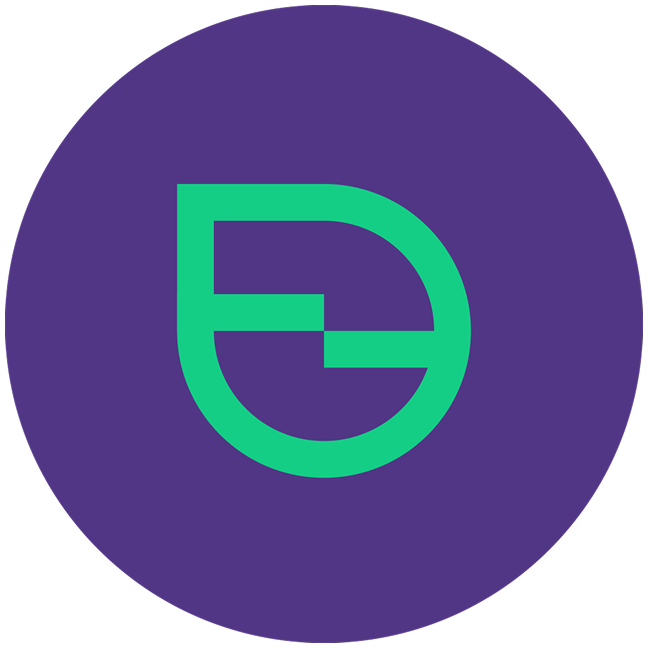
I am not sure when the “step” appeared, connecting the first letters of each name, but it became the focus really quickly and I created a lot of versions until I landed on the result you see on the right.
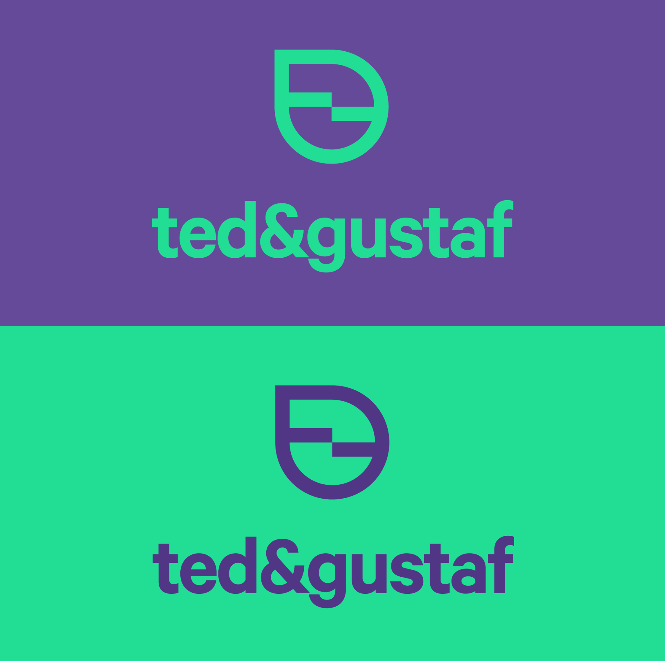
The logo became very versatile, with horizontal and standing versions and with two Primary colors (Except for black and white).
The font I found was a great variety of some of the most famous one’s out there.