
A new agency in Stockholm approached me about creating a brand identity.

A consultant agency with top notch experts.
A new agency in Stockholm approached me about creating a brand identity.
We set up a workshop for finding the fitting name. Discussed values and goals through various excercises.
I returned to my chambers and started collecting and categorizing everything for an easy overview of the workshop results.
The following weeks were spent on the name, the overall feeling and the mission of the consultancy,
AS we narrowed it down to two names, I created two possible ways forward, just in case the names were taken or already in use.
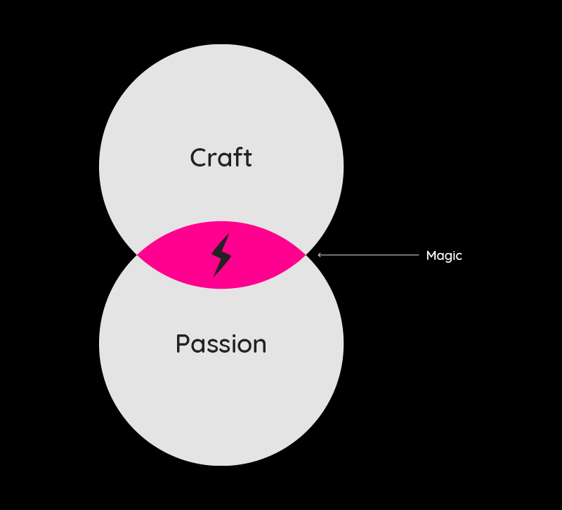
The result was a brand with a luxury and very niche look and feel. Simple yet sophisticated.
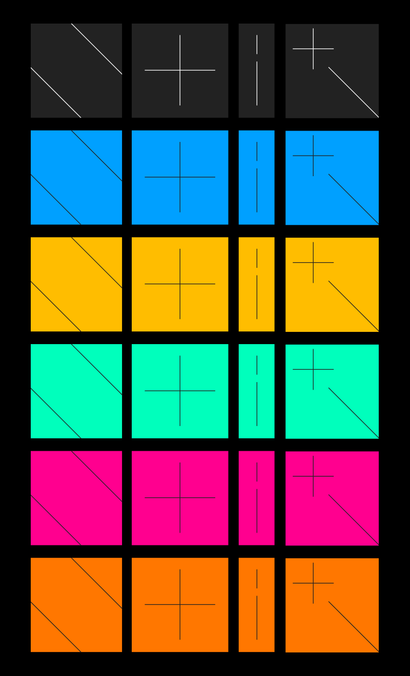
To complement the serif and classic font, I created a simple and minimal graphic language based on the letters in the name.
With complimentary colors, together with the black and white, the identity grew and added another luxury dimension.